FedEx Retail Transformation Project202
FedEx Retail Transformation is an integration of several software applications currently used in FedEx Office locations and online. The legacy software systems used across 2,000 FedEx Office locations, which had been pieced together over the years by different teams across various platforms, posed several problems. We are driving Retail Transformation to improve customer and employee interactions and reduce application complexity and redundancy, creating an intuitive, guided selling solution.
![]()
My Role: • User Experience • User Interface • Interaction Design


How it
Works
FedEx Retail Transformation Projekt202 helps to improve customer and employee interactions and reduce application complexity and redundancy, creating an intuitive, guided selling solution.
Who
it’s For
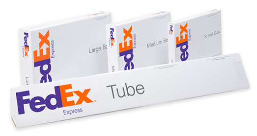
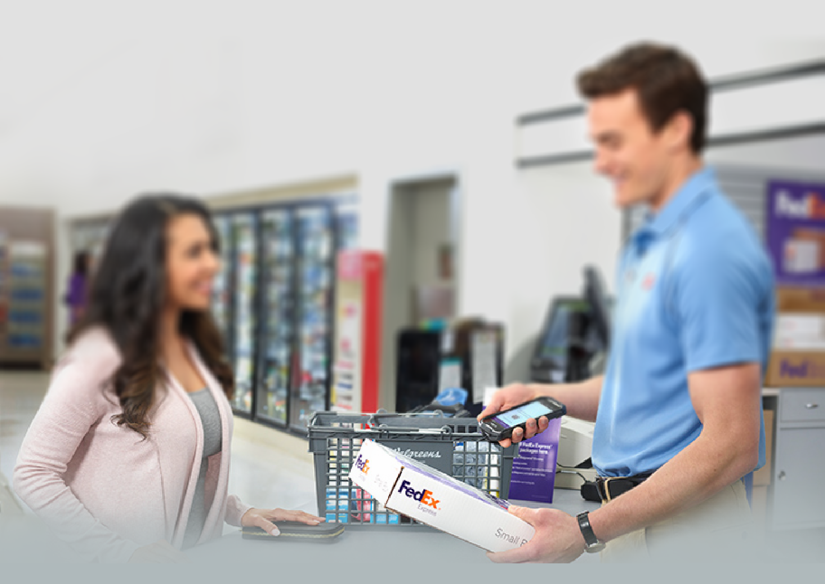
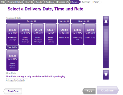
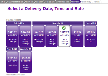
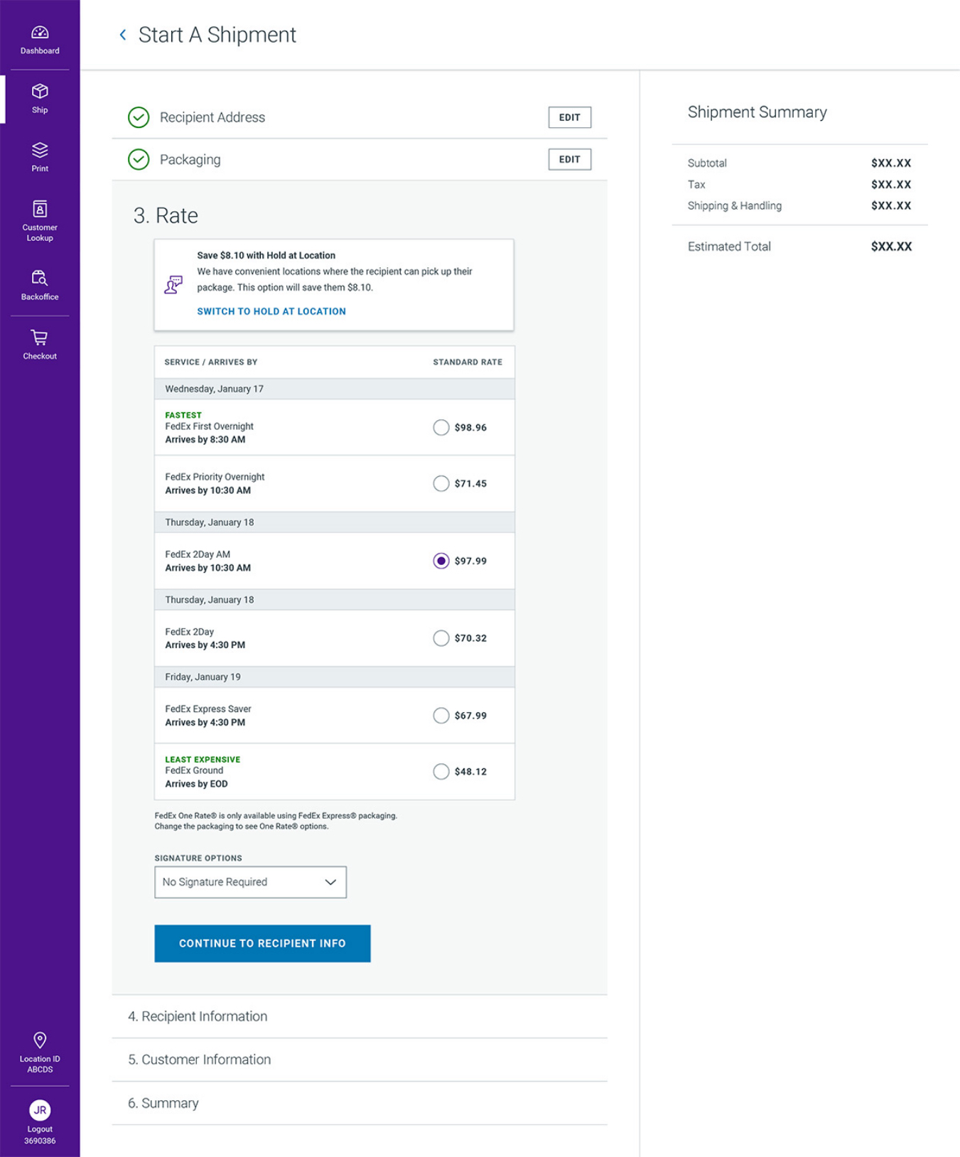
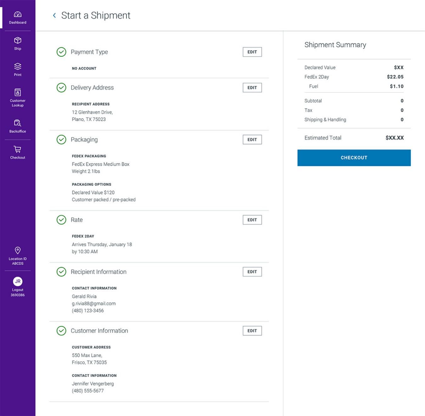
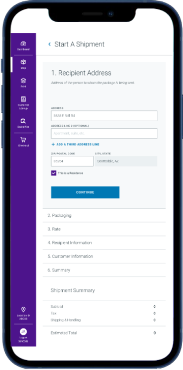
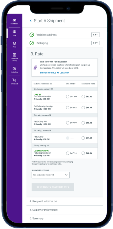
Online solution for customers to create a shipping label anytime, from anywhere and available as web, tabloid, and mobile experience, iOS and Android native apps for FedEx Team Members & Agents, and Managers in all supported countries and 22 languages.
The
Problem
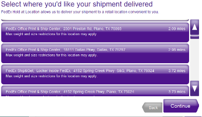
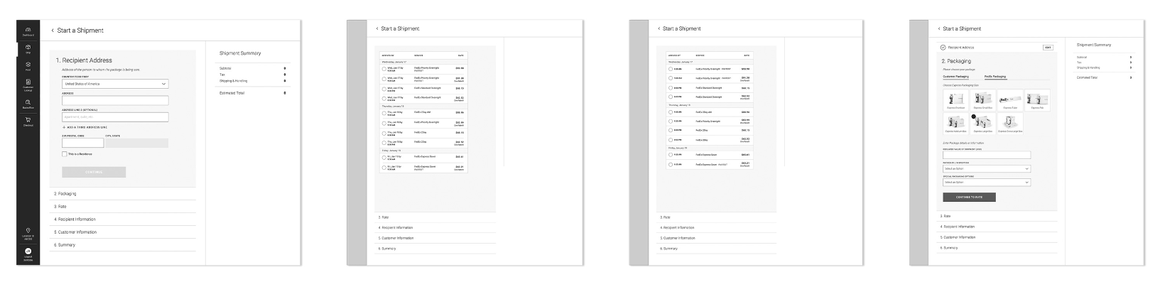
Previous FedEx Retail Transformation for shipping app was messy, not effective in providing flawless navigation through the process, and not consistent with brand style guides.
Old Retail Transformation app screen shots
How I
Helped
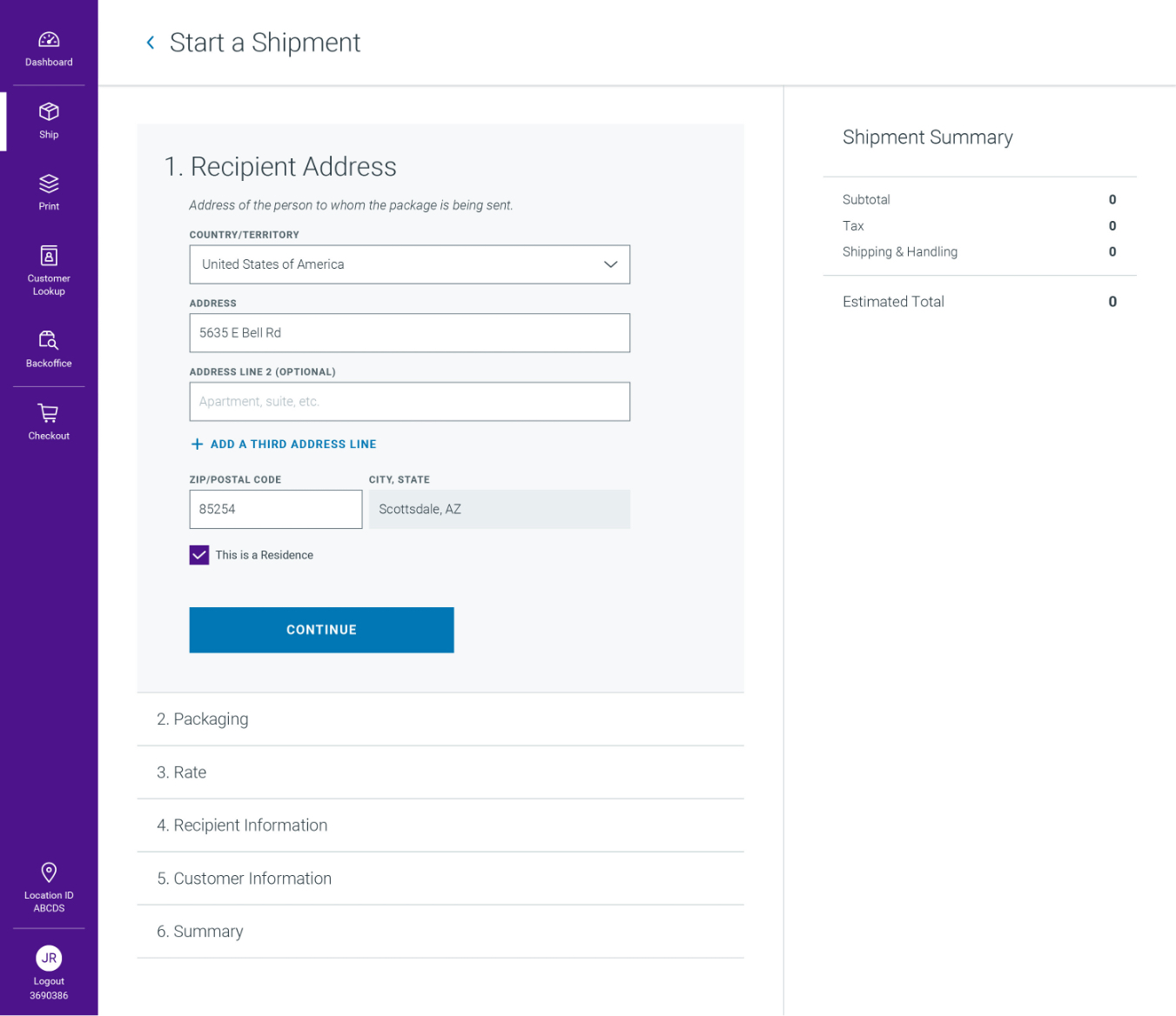
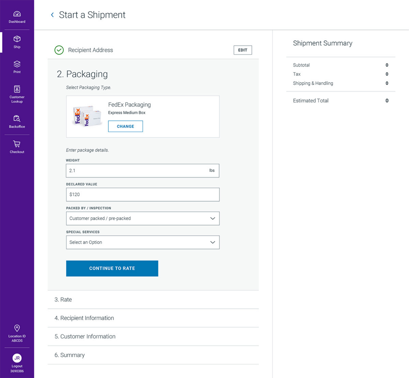
Developed a ground-up redesign of FedEx Retail Transformation’s Create a shipment app features to increase the conversion while improving the user experience.
My
Process
The first approach before starting anything -Defining the problem.
I had to understand clearly what I am trying to solve at FedEx because UX design is the process of solving a problem for the user, helping them achieve their goals with ease and more than that make them feel delightful while doing so. This very first step is the principle of whatever method I may use in the process, understanding the problems and the objectives before working on them. After understanding the problems, the next step was to look at the existing product, if available, or land on Google, start to search for some inspiration, competitor’s product, or any other products with the same functions. Then I started sketching my ideas, doing some wireframes.
Instead of Research on Google, I do Research from Users (Research)
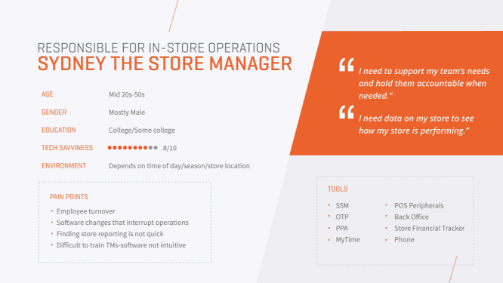
Based on use cases and inputs from FedEx stakeholders I started thinking about my users. Who are they, where are they from? Where can you find them?
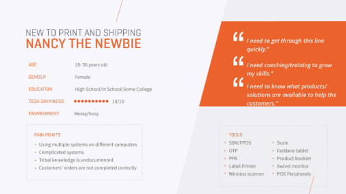
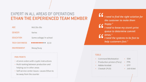
Build User Persona
I developed the personas based on the data collected through user research, surveys by the designated stakeholders. This helped me to recognize that different people have different needs, expectations, and pain points. Creating personas helped to understand users’ needs, experiences, behaviors, and goals that further helped in developing the design solution. Developing personas made the design task easy as they guide the ideation processes and help achieve the goal of creating a good user experience for the target user group.
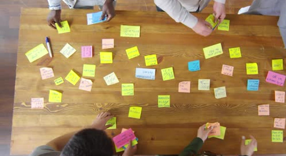
Creating User Stories
Then, I conducted the brainstorming process with whiteboarding, sticky notes as it’s a very important thing to do in gathering the inputs. I went back and referred to the time to time in the process to make sure everyone in the same page in communicating the information.
Creating Scenario Map
To prevent confusion and to make sure everyone is clear about what we build and what is our goal, I included stakeholders from the early step. Then, I presented them the user insights and the user personas and collected their goals for the user, based on the product requirements. However, there are more things to cover when I dig deeper in these processes, they are all belongs to Information Architecture, I build the flow for data and how to drive user from start to finish. These are just basic steps; I may have different approaches depends on the product requirements.
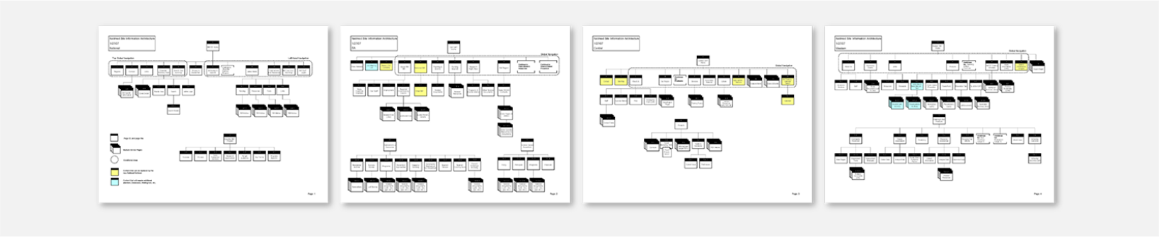
Scenario Maps/Sitemaps
Then the next step is to create the user flow. I tried to simplify the flow so that the user goes through a smooth, easy but clear flow to create a better experience.
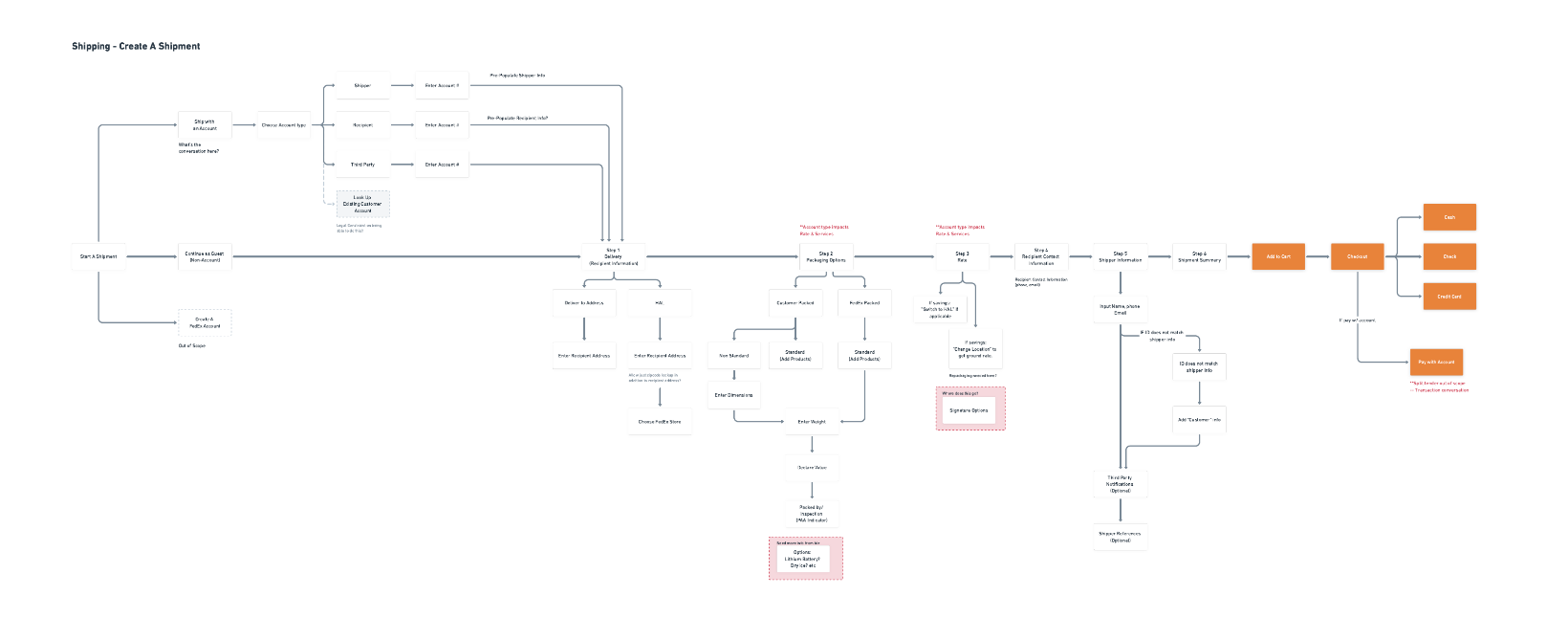
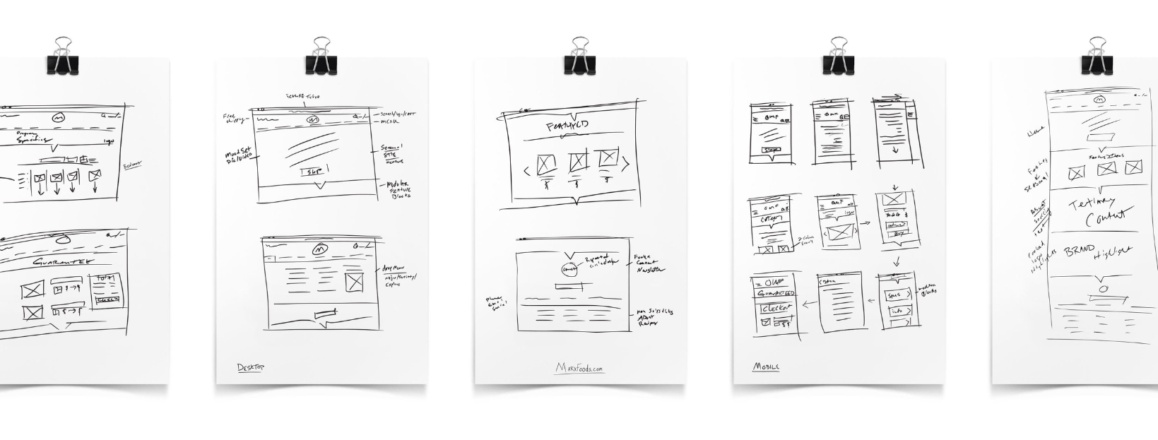
Pen and Pencil Sketches
With user data in hand and a thorough understanding of the features we wanted to include, the project moved onto the stacks of paper and sharpie stage. Without being able to erase we were able to clearly finish each thought and keep drawing to conclusion, eventually landing on just the right basic feel. At this stage I was able to work through the varying levels of content, eventually designing a blocking system where the content could be added as needed while never feeling forced.
Wireframes
Start creating Wireframes and Interaction Prototypes (Design)
Many designers like to do high-fidelity wireframes, but in my process, I developed low-fidelity first. The reason is I don’t want to spend much time on drawing, but to spend more time on exploring the designs. Wireframes help to do that. I don’t think too much about the pixels, how big or small the text, I just want to explore different design approaches and see what the best solution is. I followed the design sprint at this step to provide a quick but high-quality result. The main point of wireframes is to let everyone give their idea, exploring options and once everyone agrees on one, we can start a further design without any changes or confusion. In the next step, I shared the mockup screens with developers through Zeplin and the get feedback to see if they have any technical issues.
From Low
Fidelity
to High
The UI part is quite complicated to get right. I had to focus to keep UX and UI to stay very closely with each other. I tried to give nice look and feel and at the same time not compromising on the UX part. For this, I had to be strict on using colors, spacing, padding, font size by following the FedEx brand style guide to keep the consistency of designs.

UI
Clean, data-focused product design
When approaching the design, I wanted to make sure that legibility led the endeavor. As per FedEx brand style guidelines, mainly focused on their primary colors to keep the design easy on the eyes. I used pops of vibrant purple to call attention to important areas of the interface like the primary navigation and various calls to action.
Bespoken mobile design
With execution of the mobile design of the platform in mind throughout the entire product design process, I seamlessly laid out the interface for devices with smaller screens. More detailed interactions such as the chart make use of a horizontal swipe gesture while more lengthy areas, such as content cards, respond well to the verticality of a mobile screen.

Result
FedEx Retail Transformation Projekt202’s Create a shipment project was successful in bringing an innovative UX and UI app that is easy to understand and use for creating the shipment. The look and feel came out clean and crispy to give a novel appearance.