Online e-Commerce User Experience
Creating highly usable and intuitive designs to detail and UX design expertise of improve the usability and usefulness of web & mobile apps.
![]()
My Role: • User Experience • User Interface • Visual Design

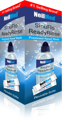


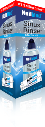

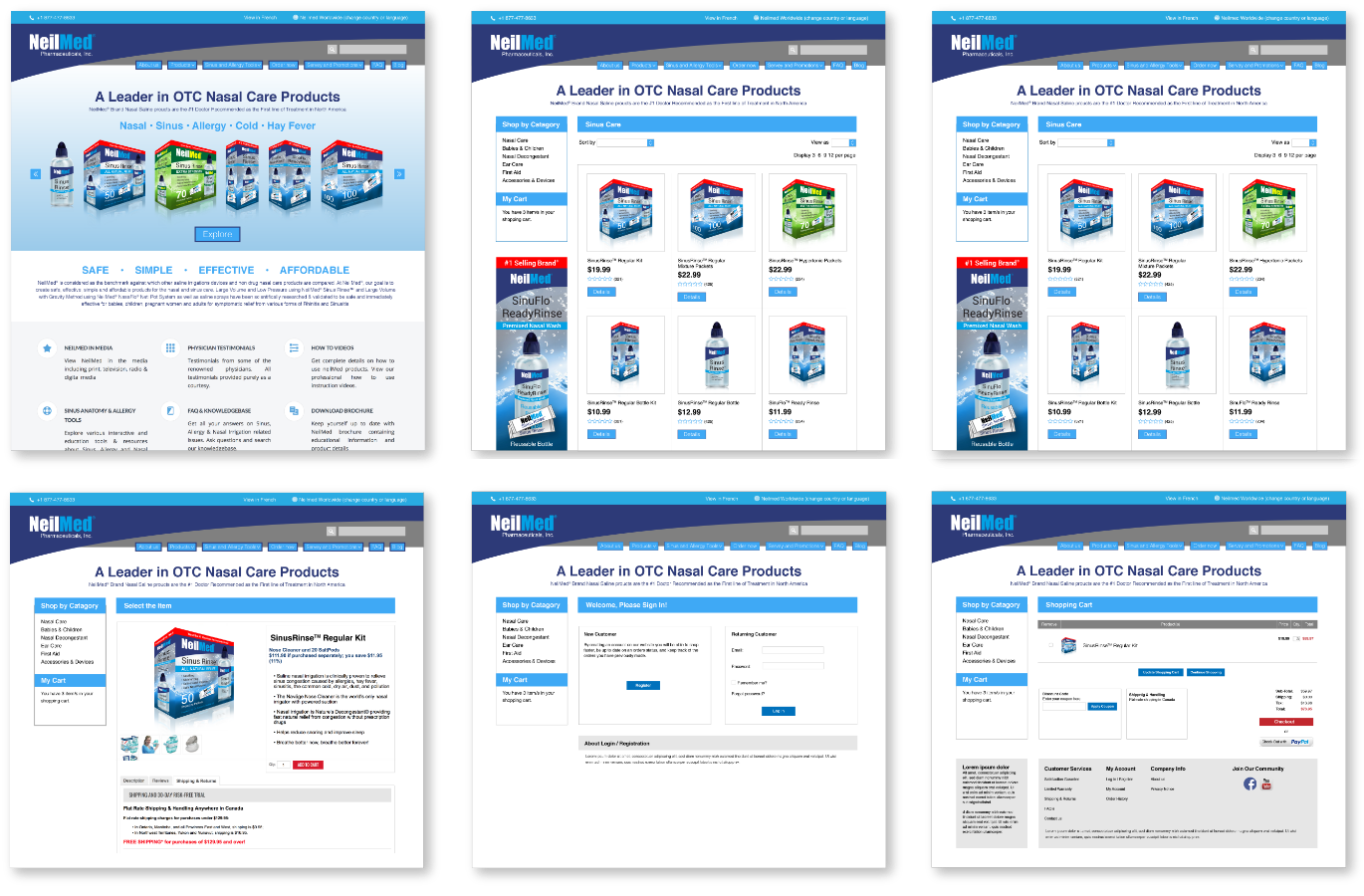
A Leader in OTC Nasal Care Products
NeilMed Brand Nasal Saline proucts are the #1 Doctor Recommended as the First line of Treatment in North America
Over a span of 3 months, I became part of the Neilmed team of Project Managers, UX Strategists, UI Designers and Developers to lead the UX Design for the website. My role was to build out wireframes and a Sketch and InVision prototype for the full website redesign of PMMS. When I came on board, the UX Strategists had done extensive user and competitive research, as well as had built out a new IA.
The Challenge
When I began this project, I spent time familiarizing myself with the PMMS website. I explored all of its pages and contents, got to know the user flow of the medical directory map, and began to think of how it could all be improved.
The structure of the IA was fairly well done, and it needed only some changes and minor improvements. But overall, the website was old, static and was riddled with areas that had far too much content, much of which the clients wanted to hold on to for the new website.
The
Solution
Based on the research that had been done by the UX Strategists, I began to layout the top level landing pages of what would be the new website. We chose consciously not to design mobile first, because data showed that the majority of PMMS’s users were not very tech savvy, and far more likely to browse the website via desktop.
As I mentioned above, the IA remained fairly similar, but the hierarchy and layout changed dramatically. Before I built out a wireframe for each page, I would write a list of the most important content to be included on that page, and design accordingly, all the while recycling content blocks where possible, to reduce the workload for the developers.
I began with some wireframes of the homepage and some of the landing pages.
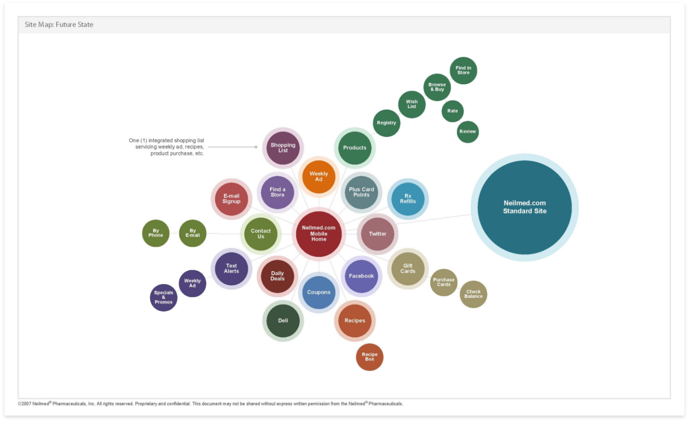
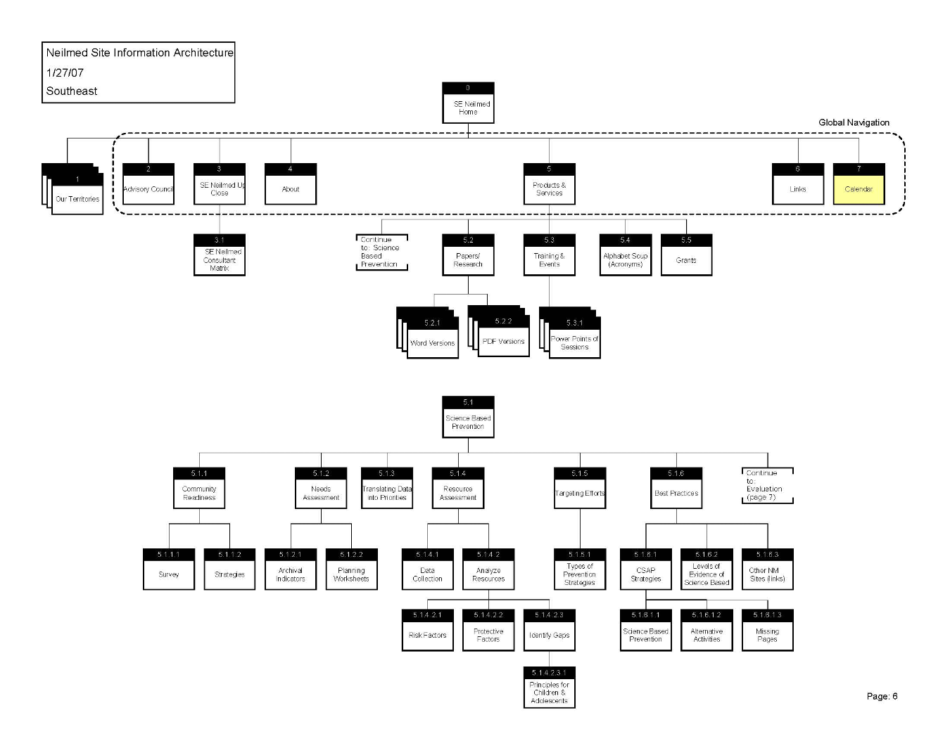
Site map and Interactive maps
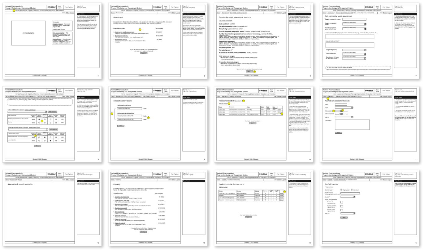
The map for the Pharmacy Directory proved to be a challenging portion of the website, and I am proud of the outcome of the user flow I devised. The Pharmacy Directory map was not at all user friendly. It lacked interactivity, any filtration, and the user flow was confusing. With 52 “Regions” nearly 600 pharmacies, and users who didn’t understand what exactly differentiated a region from area, my task of designing a new and much more interactive map was certainly a challenge.
With so many different types of users – from prospective or current doctors, to prospective or current parents, donors and alumni, there had to be different ways of navigating the flow of the map. They had to be able to search by region as well as by Pharmacy, and I wanted to provide a smart search for users who knew what they were looking for.
Interactivity Document
After the wireframes and prototypes had been approved by Neilmed pharmaceuticals management, I wrote an Interactivity Document. The document covered details for each page of the website and interactions of the map user flows.
Mid-fidelity wireframes
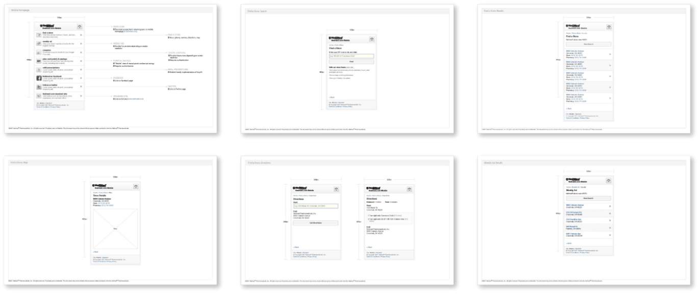
Sharing some mobile wireframes
Conclusion
The new PMMS website launched officially in December 2007. It’s a great improvement from what PMMS had previously, and I know it will help PMMS grow. By the end of my portion of the project, I had produced over 80 wireframes and an Axure prototype. I loved working with Neilmed, because working with them means contributing positively to the world by working on projects that do good!
• Developing an understanding of best practice with regards to images used, look & feel, brand style guide, color, buttons, and consistency process, how to highlight scarcity, how to draw attention to related products, how to make things easy to share, and understand the importance of detailed product descriptions.
• A strong e-Commerce visuals how to simplify the checkout process, has a strong understanding of the sales funnel, the call to action process and how to design product pages. Understand the importance of the best type of navigation for an e-commerce site which needs more granular search and filtering options